Project Description
Dealogic.com
Version one of the site was launched in 2015. The design was a departure from the previous site but something was missing. It didn’t engage with the user. The content was stale and their was nothing ‘sticky’ about it. For version two, I was committed to improving the look and feel. I brainstormed a simplified tile structure that enhanced the brand’s credibility to showcase itself as a market leader. A site that shared Market insights, video, news, whitepapers and infographics about the global capital markets. By working closely with an external web design agency, I played I art directed the project to deliver a scalable and responsive website.
High fives all round.
ROLE: Conceptualisation. Research. Art Direction. UI design. UX
WORK COMPLETED: User Research. Wireframing. Template creation. Branding. Style guides
SECTOR: FinTech, Corporate Investment Banking

TONE OF VOICE
Before jumping into the design stage, research was undertaken to create a series of personas. What type of user would visit dealogic.com? Once completed, the user journey, the UI design and the TONE OF VOICE was researched and documented. That intangible relationship between trust, status, clarity and confidence can be made through a range of images that help build the brand. Below are a selection of curated images I collected to convey the Dealogic brand.

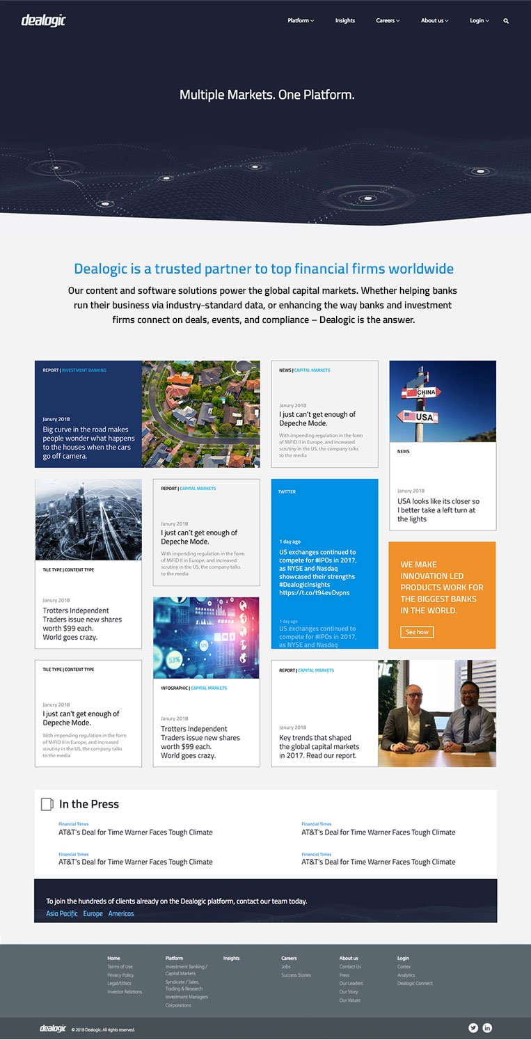
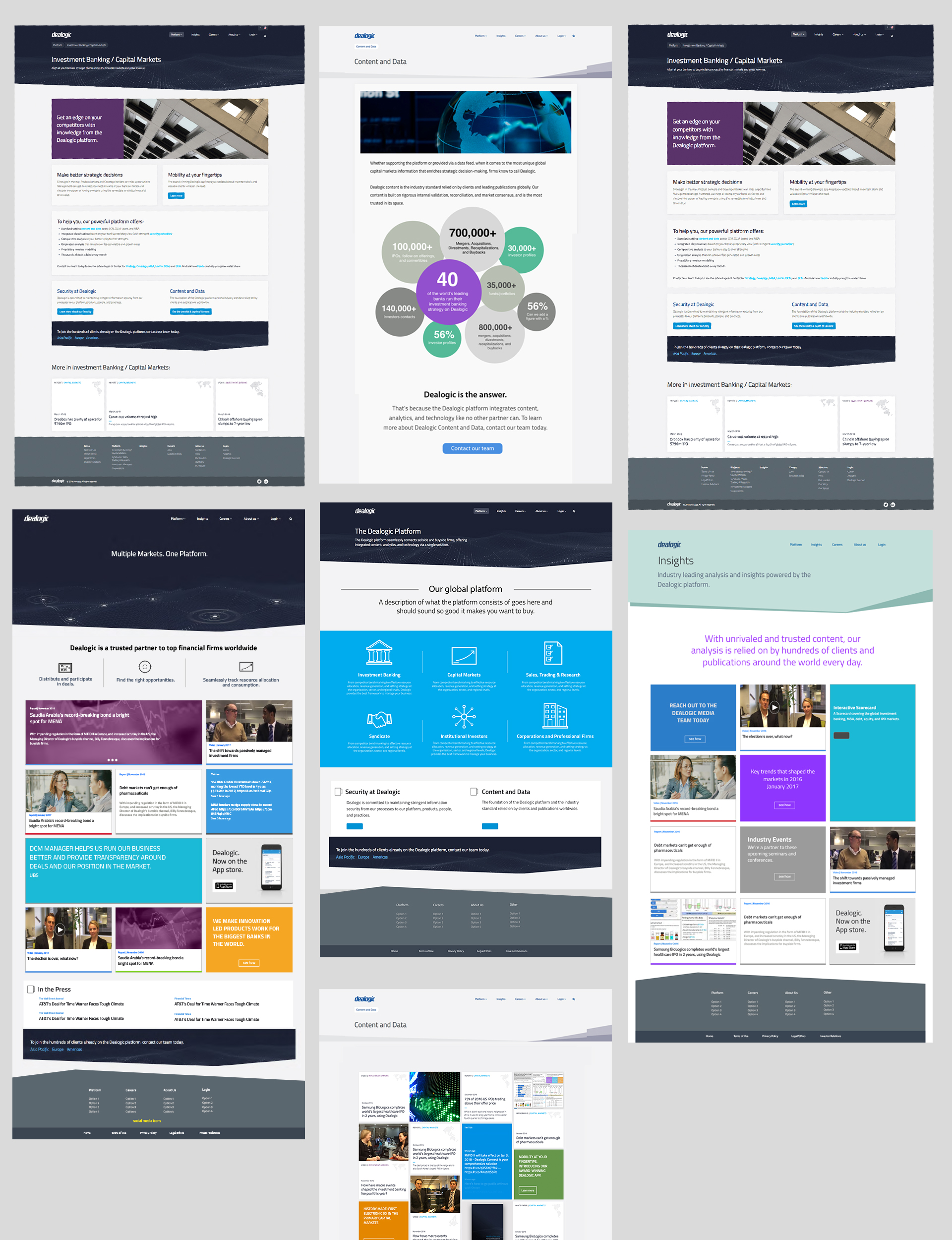
A selection of screen designs and mock-ups for the final site

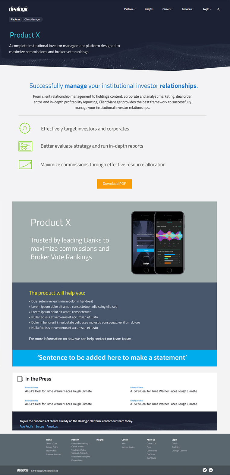
One page website to launch the Dealogic App

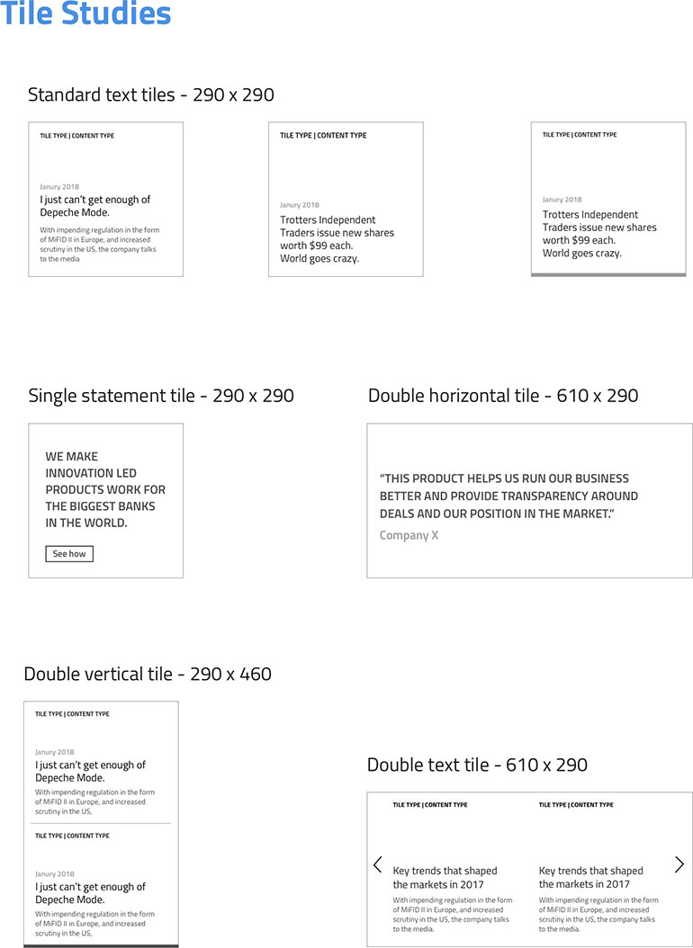
Tile studies showing the research and development undertaken in the build stage.

