Project Description
Beautiful data?
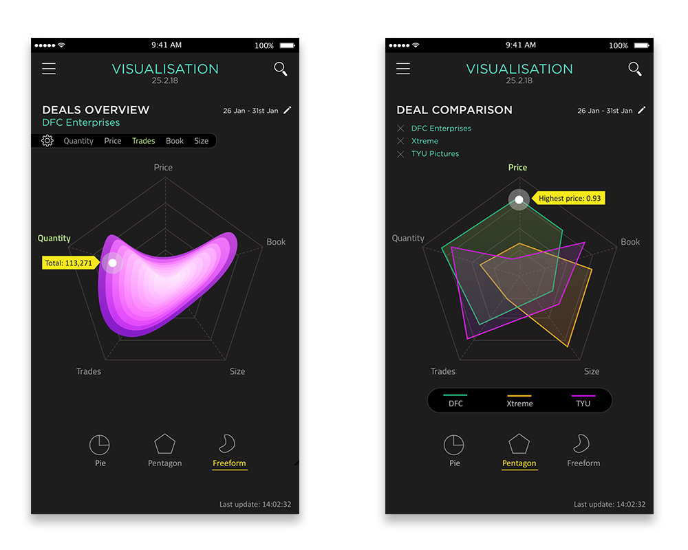
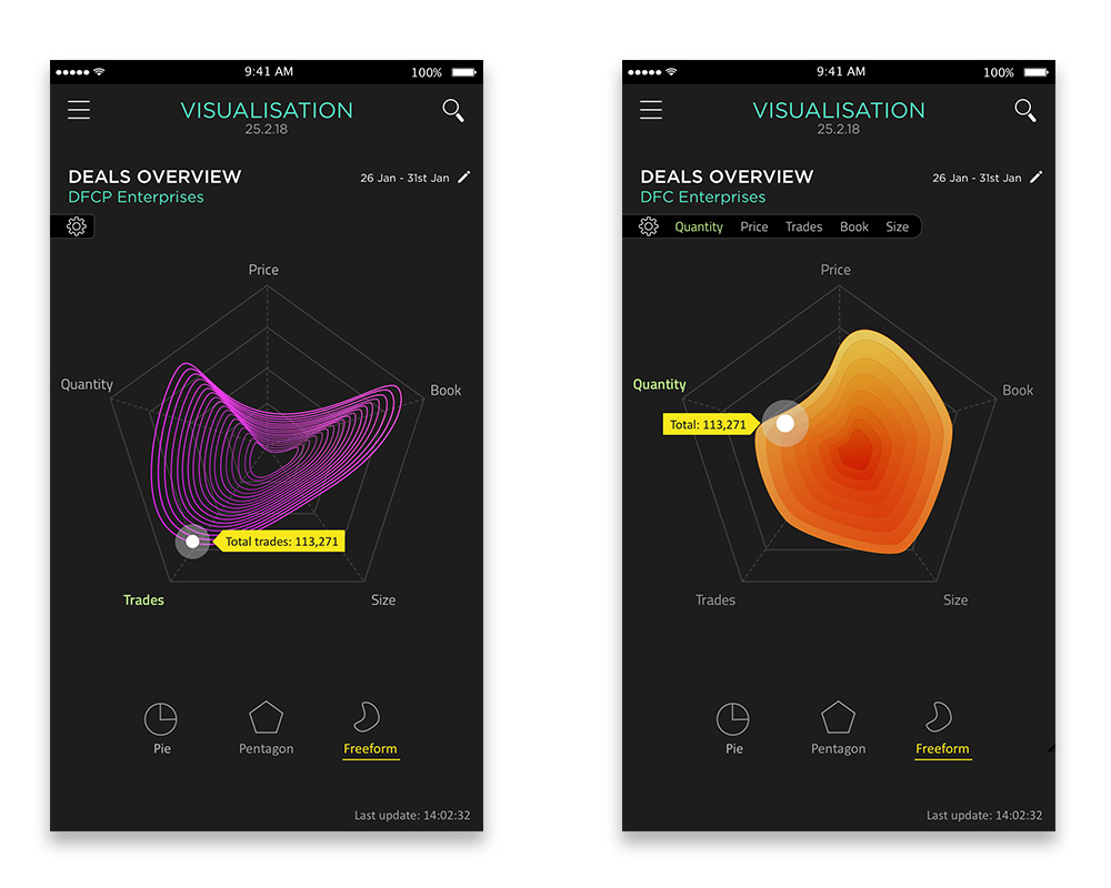
Whilst working on a few UI and UX projects that involved displaying large amounts of formulaic data, I was keen to explore ways in which data, analysis and calculations could be beautified. The idea was to introduce freeform shapes as the user’s entry point instead of using tables and charts. The designs below show how interactive shapes can give users a quick summary of the same information you find in a table. But much better looking! Users have the ability to delve deeper into the information if required.
ROLE: Ideation. Conceptualisation. Everything
WEAPON OF CHOICE: Sketch
Good design goes to heaven. Bad design goes everywhere.
Mieke Gerritzen


LOGIN PAGE & PASSWORD CONFIRMATION

Can strong visuals enable users to enjoy the experience of sifting through complex information?
DATA. BEAUTIFIED
Instead of using tables to show data, the idea was to give the user an interactive visual of the same information with a nod to aesthetics. The hexagon shape defines the data lists just like you would see in a standard table. Interacting with the shape would reveal the data.

SIMPLICITY AND ELEGANCE


